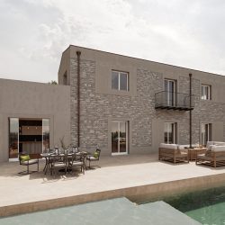

What Is Color Temperature and How Is It Measured?
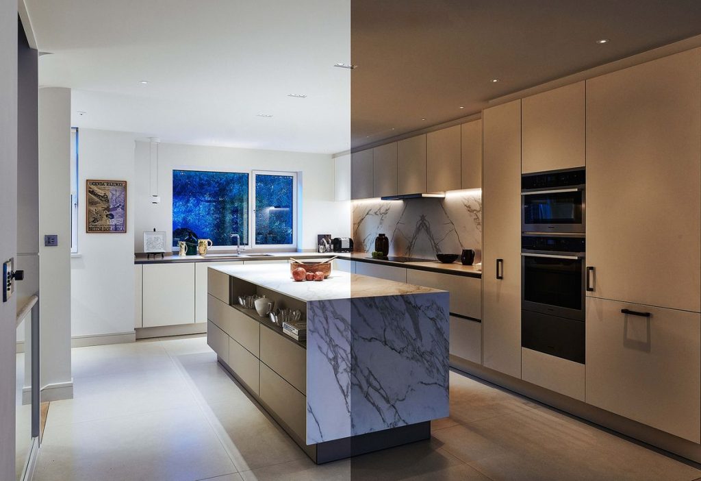
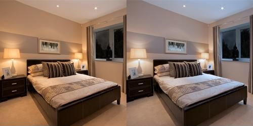
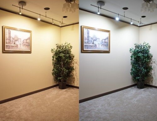
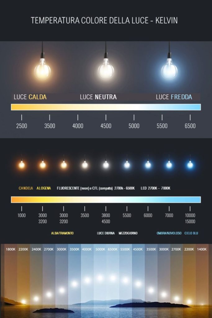
Light emitted by LED, halogen, incandescent, or fluorescent bulbs can appear warm, neutral, or cool. To understand the color temperatures of household lighting, we refer to values expressed in Kelvin (K), on a scale from 2300 K to 6500 K. The lower the Kelvin value, the warmer the light, ideal for relaxing environments. As the Kelvin value increases, the light becomes brighter and cooler, recommended where precision and attention are required:
- Warm light (<3300 K): Yellow or orange tones, cozy and relaxing.
- Neutral light (3300–5300 K): Natural white, balanced and similar to daylight.
- Cool light (>5300 K): Bluish white, bright and stimulating.

Traditional bulbs have a fixed color temperature, while LEDs allow you to choose the most suitable tone for the context, offering greater design flexibility.
The Psychology of Light: How It Affects Our Mood
Color temperature influences emotions and space perception:
-
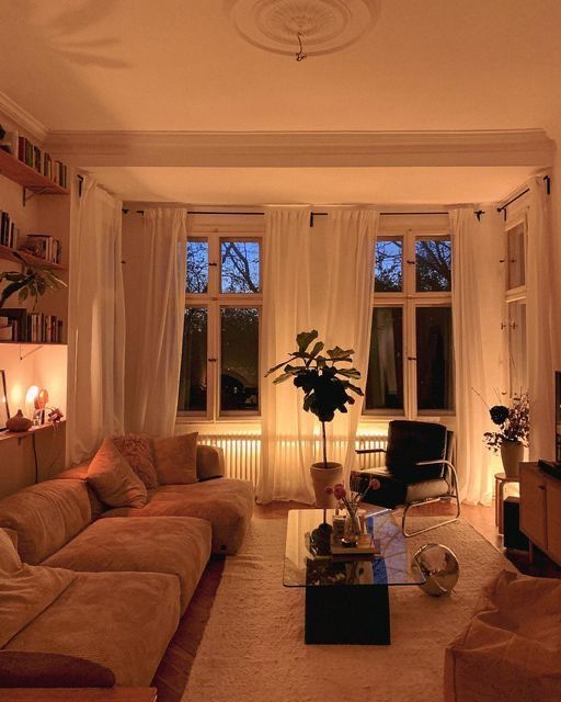
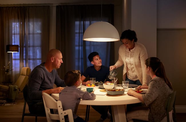
Warm white (2700–3000 K): Creates intimacy and relaxation. Ideal for living rooms, bedrooms, and restaurants. Warm light enhances natural materials like wood and stone, making spaces inviting and comfortable.
-
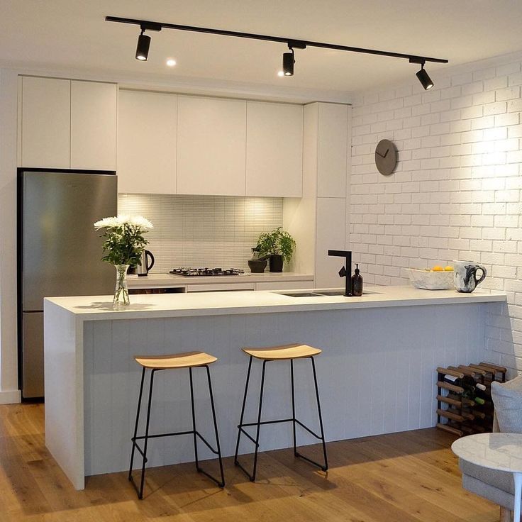
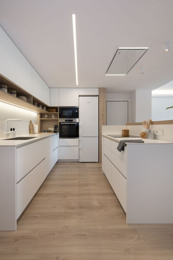
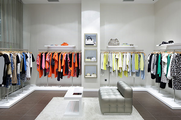
Neutral white (~4000 K): Similar to natural light, reduces eye strain, and maintains authentic colors. Perfect for kitchens, bathrooms, professional studios, and retail stores. For instance, installing natural white LED strips in a clothing store allows customers to better evaluate clothing colors.
-
Cool white (5500–6500 K): Stimulates focus and concentration. Used in offices, gyms, and hospitals, it increases brightness perception but can strain the eyes if used too long. For example, in a steakhouse, a cool 6500 K light makes the meat look less appetizing, turning it slightly purplish. Warm light, on the other hand, highlights natural reds and enhances dishes.
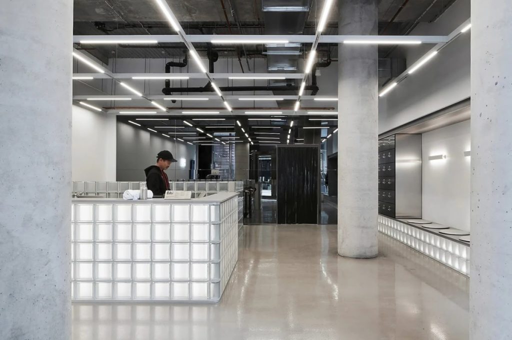
Some concrete examples: in a steakhouse, a cool 6500 K light makes the meat look less appetizing, shifting toward purplish tones. Warm light, on the other hand, enhances the natural reds and makes the dishes more appealing.

In a coffee shop, baked goods should be illuminated with a light that enhances their warm tones and conveys their freshness; cool light, on the other hand, makes them look stale.


How Light Changes the Perception of Materials and Objects
Color temperature is a powerful tool for playing with materials and colors:
- Warm light → enhances reds, yellows, and oranges; perfect for wood, natural fabrics, and stone.
- Cool light → highlights blues and greens; ideal for modern or metallic environments.
- Neutral light → keeps all colors faithful, reducing visual strain.
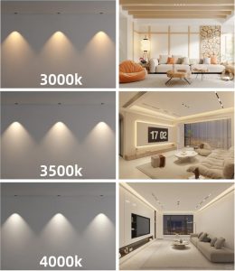
By combining different lamps or using colored filters, you can create dramatic atmospheres, define zones, and emphasize specific objects.
Light in Different Contexts: Homes and Commercial Spaces
The choice of color temperature varies depending on the intended use:
Residential:
- Living rooms and bedrooms → warm light for comfort and relaxation.
- Kitchen and bathroom → neutral light for accuracy and color fidelity.
- Garage or utility areas → cool light for visibility and practicality.


Color Rendering Index (CRI): Color Accuracy
Beyond temperature, another key element is the CRI (Color Rendering Index). It indicates, on a scale from 50 to 100, how accurately a lamp renders the colors it illuminates. The higher the CRI, the better the light quality and the color fidelity, reducing unwanted effects such as metamerism, already discussed in one of our previous articles:
- CRI >90: Excellent, perfect for shops, art studios, and homes where true color representation is important.
- CRI 80–90: Good, suitable for most everyday applications.
- CRI <80: Can distort colors, making them appear dull or unnatural.
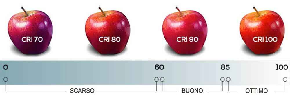
For example, a CRI of 70–80 may make colors look faded—acceptable for a basement—but kitchens require CRI 90+ lights to represent food colors accurately, crucial both at home and in commercial spaces.
Practical Tips for Choosing the Right Light
- Consider the room’s purpose: relaxation, work, display of products or materials.
- Consider style and materials: wood and natural fabrics favor warm light; metallic or modern surfaces are enhanced by cool light.
- Check the CRI: at least 80 for most environments, above 90 for perfect color fidelity.
- Experiment with combinations: warm light for ambiance, neutral light for work, and cool light for functional areas.