
Color in interior architecture: a design, sensory, and emotional tool

→ Leggi l’articolo in italiano

There is something deeply cultural in how we think about color in architecture. For centuries, the debate between matter and decoration, between structure and ornament, between white and color, has resurfaced cyclically, shaping the way we design, inhabit, and perceive space.

During a lecture on the history of contemporary architecture in my first year of university, one sentence from my professor struck me:

“The history of architecture we study is often in black and white.”

This wasn’t just about the editorial choices in academic textbooks. Those monochrome images weren’t merely a cost-saving compromise—they were a true abstraction: a way of framing architecture within its plastic and rational dimension, stripping it of color, context, and real life.

Giò Ponti once wrote:

“Architecture, a plastic and abstract fact, is colorless… we consider it without color. Like sculpture. Like crystal.”

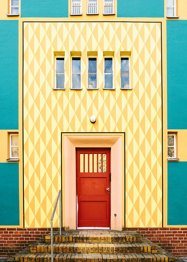
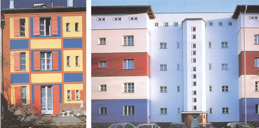
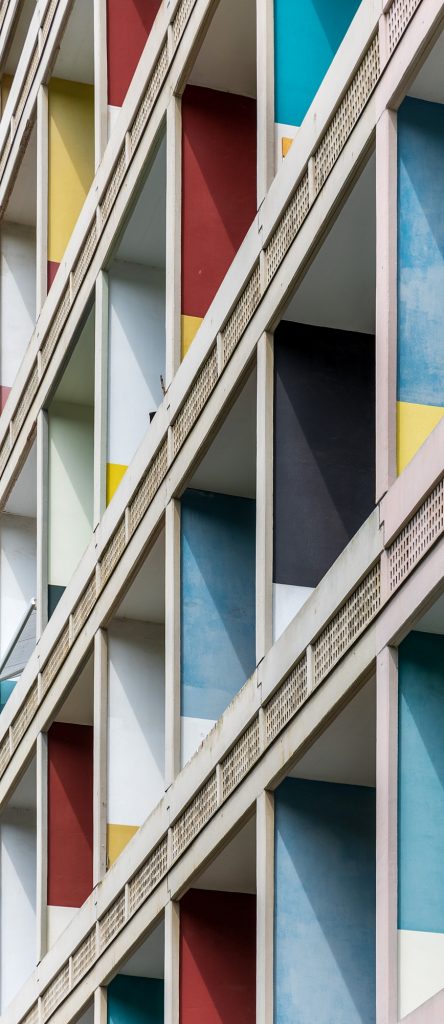
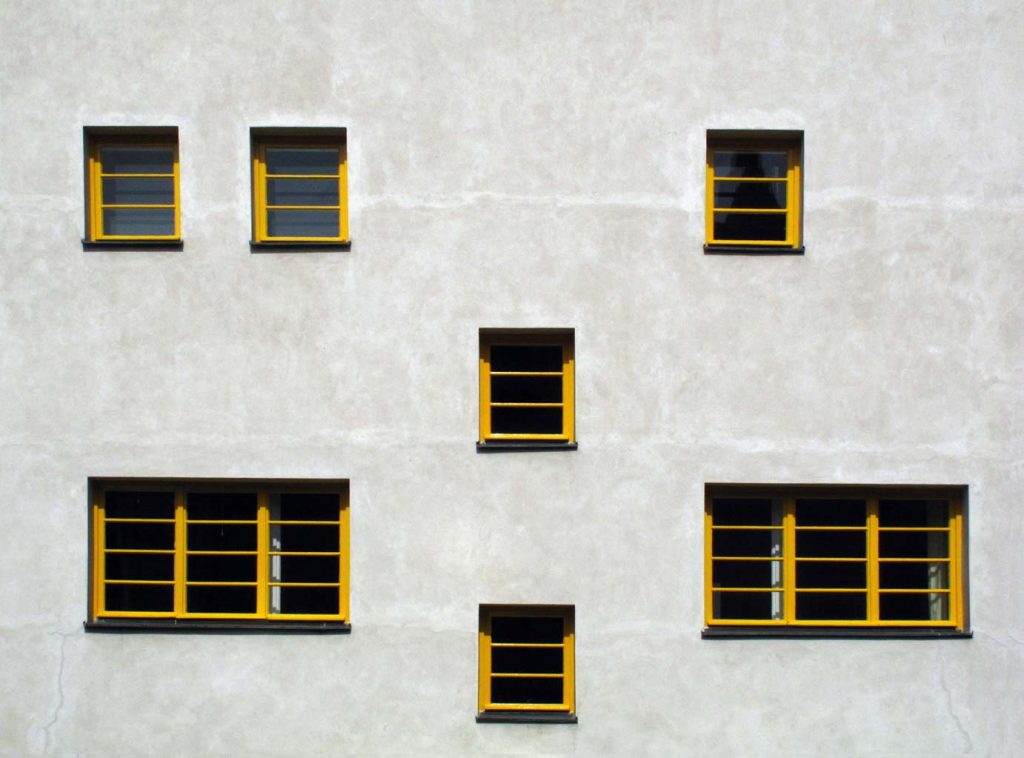
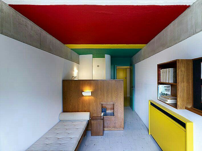
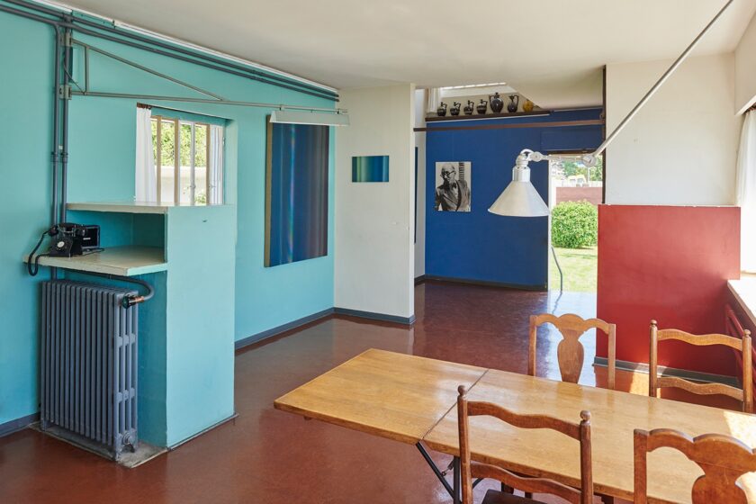
But the reality is often very different. Seeing the works of great masters in person—Bruno Taut, Le Corbusier, Adolf Loos—reveals a bold, sometimes surprising use of color. Spaces that appeared neutral and pristine in books are, in reality, rich in shades, materials, and contrasts.

colore e architettura
housing complex, Bruno Taut
colore e architettura
housing complex, Bruno Taut
colore e architettura
Unité d'Habitation, Le Corbusier
colore e architettura
Villa Müller, Adolf Loos

Minimalism, White, and the Aesthetics of the Present

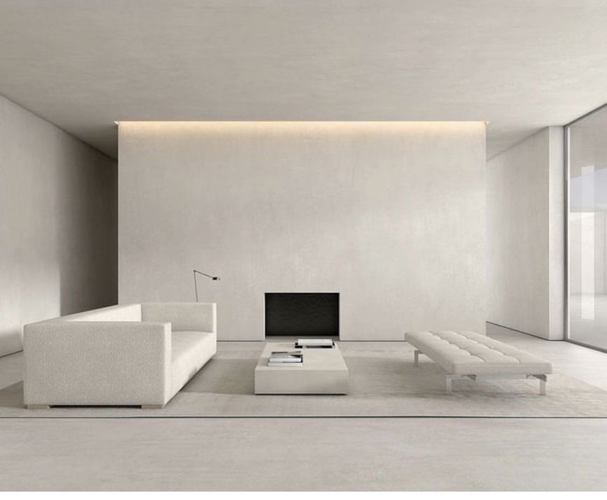
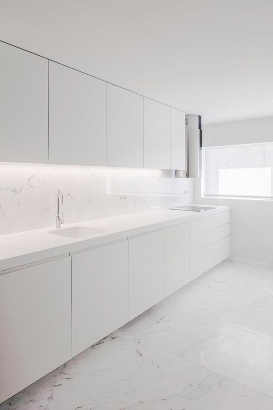
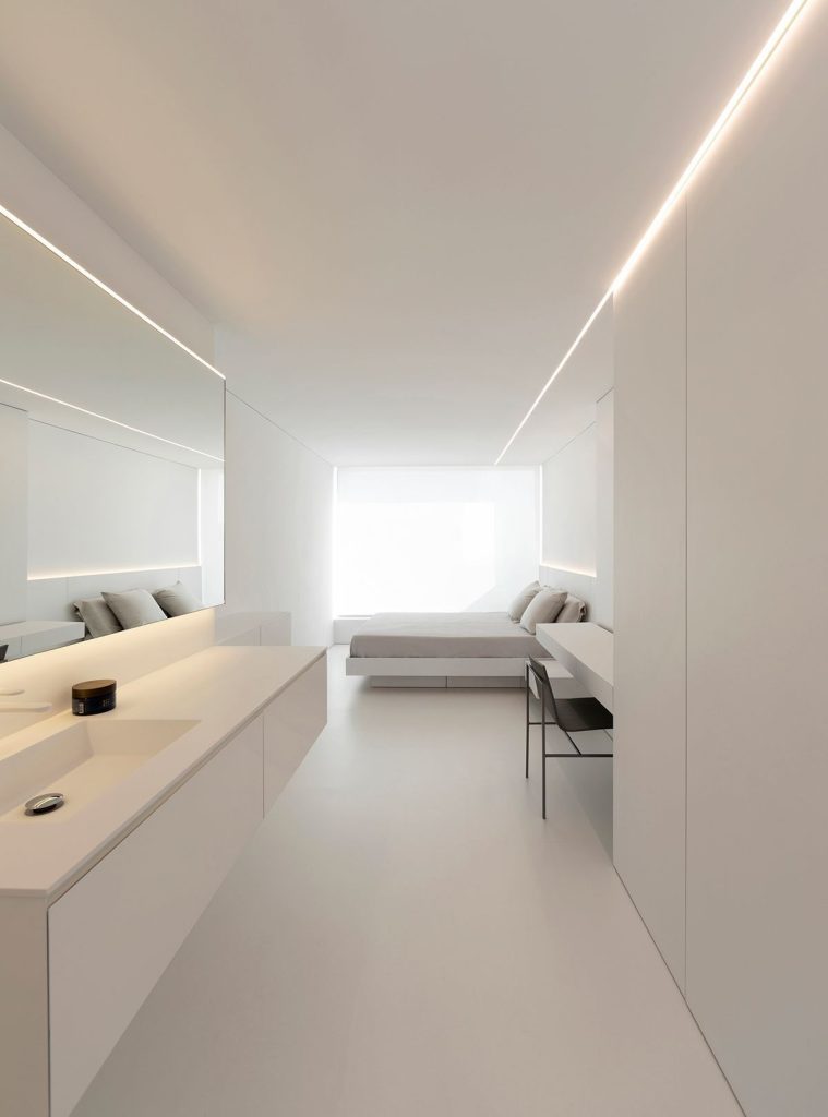
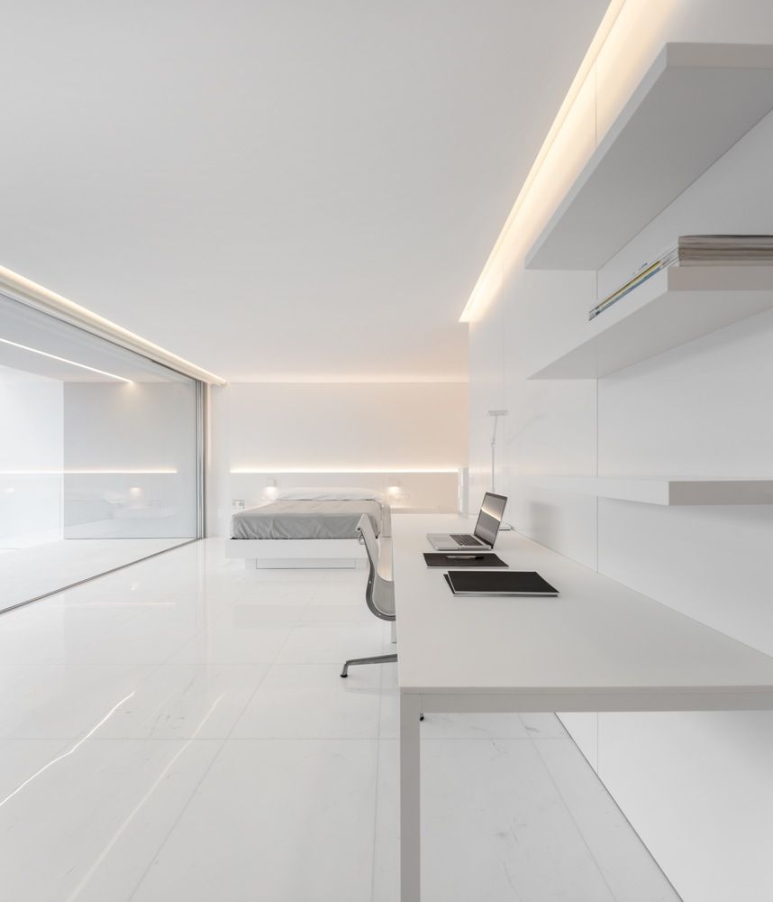
Today, flipping through architecture magazines, it’s not uncommon to find interiors described as “minimalist,” dominated by white, black, and charcoal gray. These are hyper-bright, controlled environments with rarefied atmospheres.

This aesthetic has deep roots: white enhances form, light sculpts volume, and the absence of color promises cleanliness and rigor. But too often it becomes a visual dogma, reducing color to an interference to be avoided.

In truth, color has always been part of architectural language—not just ornament. It has been used in every era, from Egyptian frescoes to Pompeian villas, through to 18th-century Classicism. In interiors, color became a structural element starting with the Louis XV style and has never stopped dialoguing with form, material, and light since then.

Le Corbusier and the Architectural Palette

A powerful example of this awareness is Le Corbusier, the master of the Modern Movement, often associated with pure white buildings.

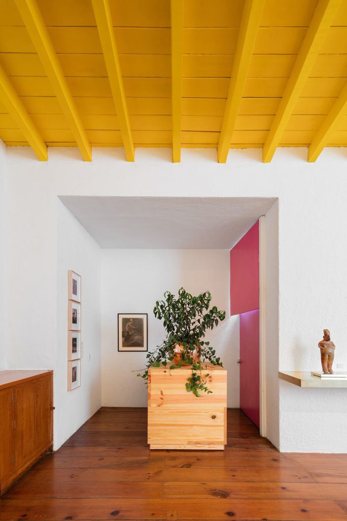
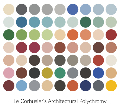
Yet Le Corbusier developed a Claviers de couleurs—a codified palette of hues designed for architecture—and created surprisingly polychrome interiors: blue walls, soft greens, ochre yellows. For him, color was not decoration—it was an integral part of spatial perception.

As he wrote in Polychromie Architecturale (1931), “Color shapes space and guides perception.”

colore e architettura

Color, Light, and Material: An Integrated System

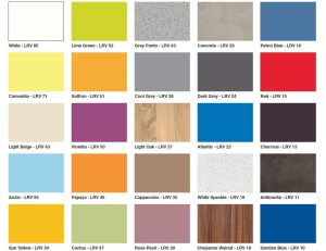
In interior design, color must be considered together with light and material. A dark wall absorbs light and creates depth; a light one reflects it, expanding the space. The Light Reflectance Value (LRV) is a useful tool for evaluating the effect of a surface:

  • LRV 0: black surface, fully absorbing
  • LRV 70–85%: very light-colored walls
  • LRV 100%: a mirror
valori di LRV

Color is never neutral: it changes the perceived temperature of a room, affects mood, livability, and even our sense of time.

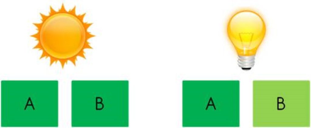
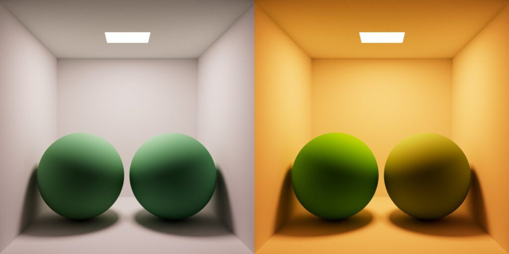
Even the phenomenon of metamerism—when color perception changes depending on light—has become a design resource rather than a flaw. Designing with “unstable” colors allows for surfaces that shift throughout the day, making spaces feel more alive and dynamic.
metamerismo
metamerismo

From Industrial Syntax to Nature-Inspired Colors

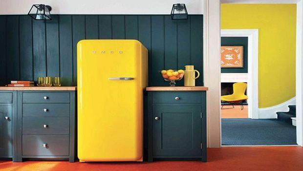
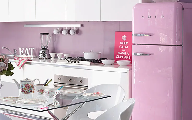
In the post-industrial consumer era, color was often used as a marketing tool. Domestic products—refrigerators, kitchens, phones—were painted in bright reds, blues, and yellows to grab attention and accelerate desire.

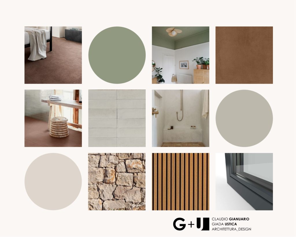
These were syntactic, decontextualized colors, applied to any object regardless of material. Today, in a context of growing environmental awareness, there’s a return to iconic, material-linked tones: the red of terracotta, the gray of concrete, the green of oxidized copper.

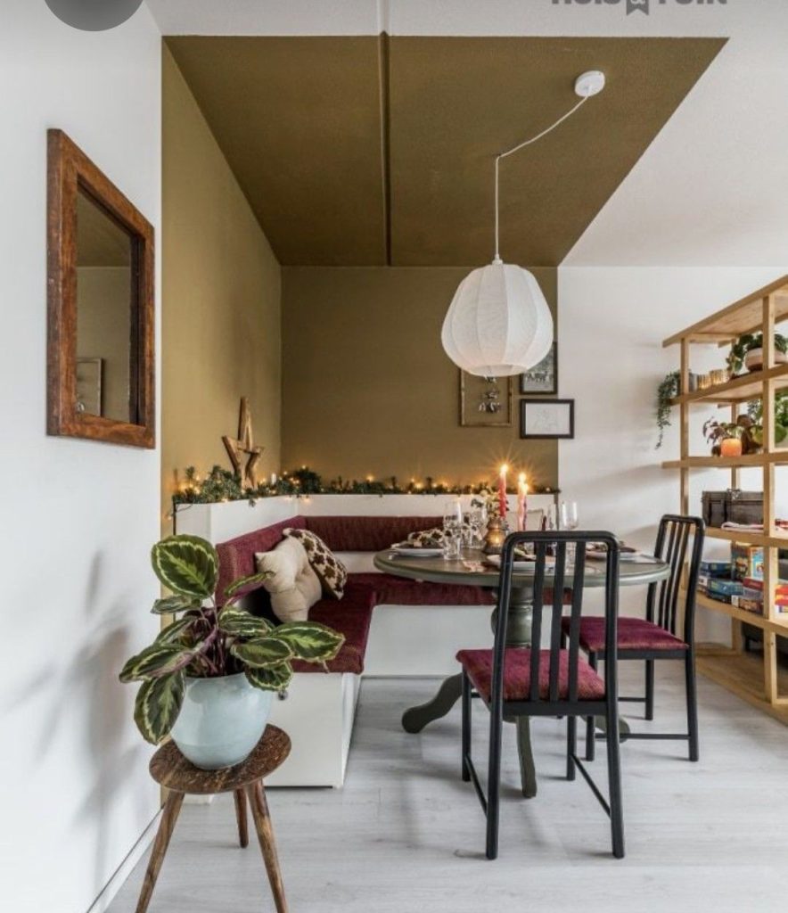
This trend gained momentum during and after the pandemic. Our renewed connection to nature and landscape has brought those outdoor colors into our homes. Palettes have become softer, earthier, more organic. Interior design has become part of a sensory ecosystem.

colore e architettura
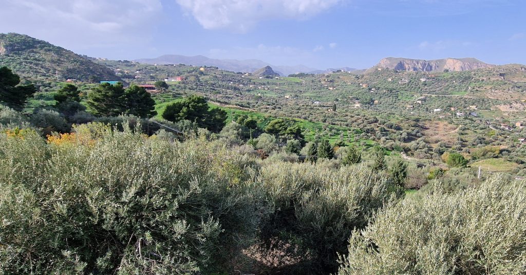
Project moodboard inspired by the surrounding landscape
metamerismo

Spatial Perception and Color Psychology
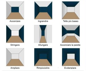
Color influences not only aesthetics but also spatial perception and psycho-physical balance. Color psychology studies demonstrate this clearly.

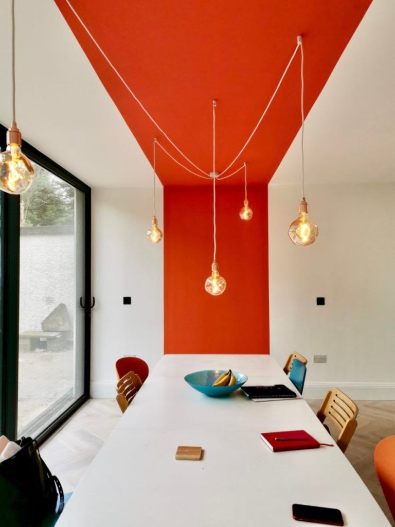
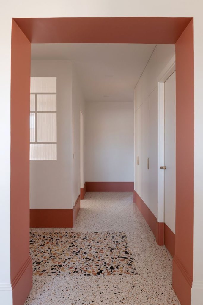
  • Warm colors (reds, oranges, siennas) visually draw walls closer and create a more intimate, cozy atmosphere. Ideal for social spaces or evening relaxation.
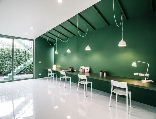
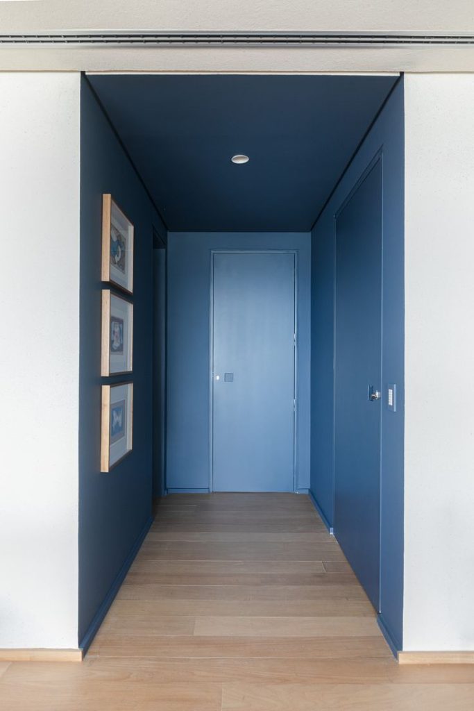
  • Cool colors (blues, greens, dusty tones) bring depth and airiness. They calm, expand space, and enhance focus.

This perception has experiential roots. Leonardo da Vinci captured it through the sfumato technique: distance appears blurred and desaturated. The farther something is, the colder and more undefined it seems.

Physiological and Neuroscientific Effects of Color

Recent studies show that color also has measurable effects on the human body:

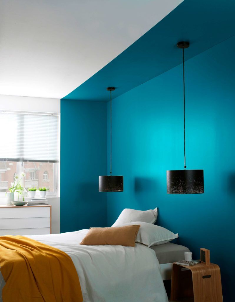
  • Blue slows heart rate and lowers blood pressure (Westland et al., 2017)
  • Green, dominant in nature, boosts attention and perceived well-being—as shown in studies on office performance with views of green areas (Lee et al., 2015)
  • Red is stimulating: it increases adrenaline, enhances responsiveness in analytical tasks, and can even influence sports performance (Hill & Barton, 2005)
colore e architettura

In short, color interacts with our nervous system. Ignoring this in interior design means missing one of the most powerful tools in the designer’s hands.

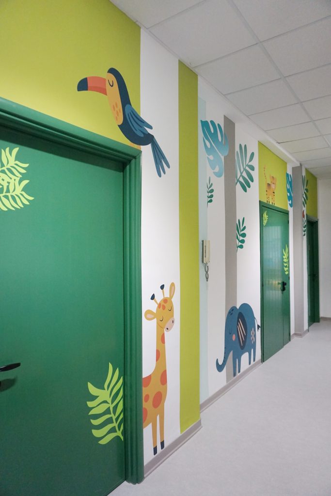
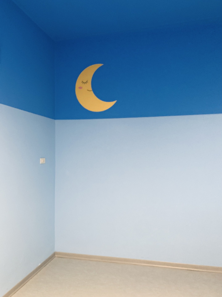
A Case Study: Color as a Design Tool in a Nursery School

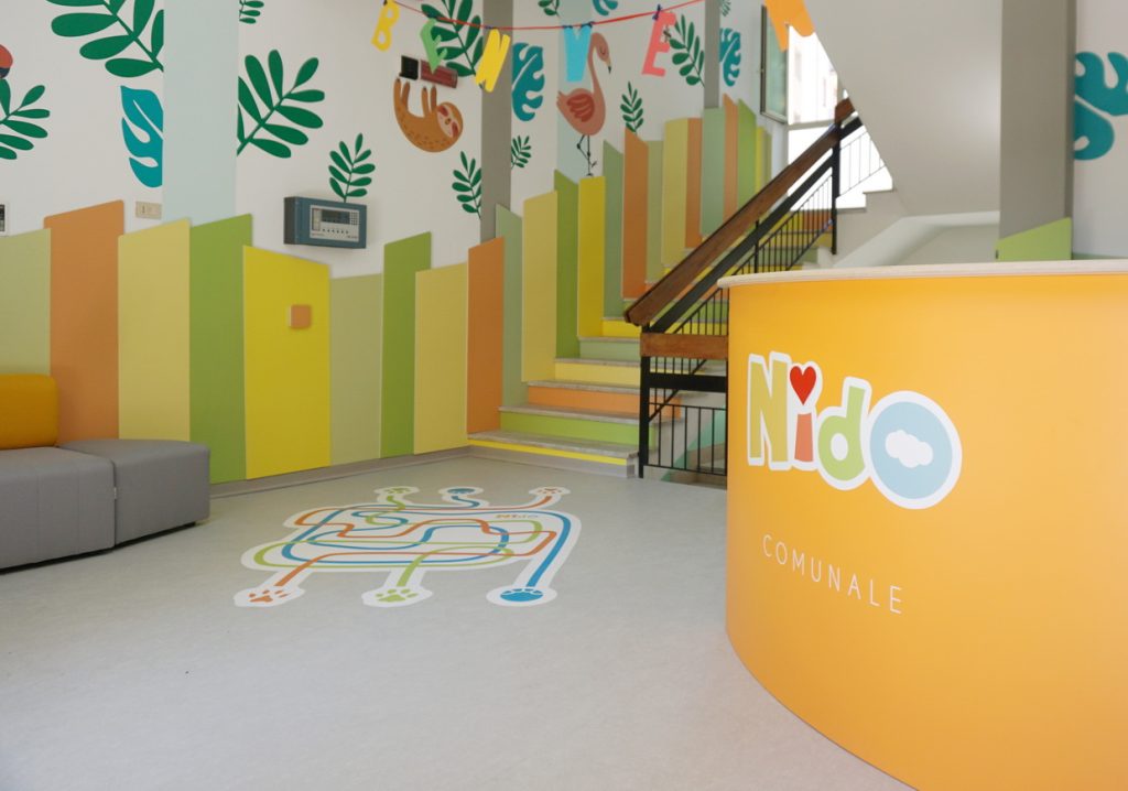
In the lightweight renovation and interior design project of a nursery in Termini Imerese, color was one of the most strategic and effective design elements. The available budget was limited, and structural interventions had to be minimal, both due to funding constraints and tight deadlines.

Precisely for this reason, color became a key tool to transform space. It was used to distinguish functions (welcome area, nap area, activity zone), create atmosphere, and stimulate children’s sensory perception—without altering the architecture.

We worked with soft, natural tones to build a welcoming, non-overstimulating, yet nuanced environment. In some cases, color even helped correct the proportions of spaces—visually enlarging darker rooms or making repetitive layouts feel more intimate and enveloping.

In an educational setting like this, color also had a pedagogical role: becoming part of children’s daily experience, positively influencing their sense of security and growth in the space.

colore e architettura

Color as a Narrative Tool

Today more than ever, color is also a narrative device. It can tell a story, evoke a memory, suggest a season. It can give character to a room without changing its shape. And above all, it can make a space truly personal.

In interior architecture, color is not a final touch—it’s a structural choice. It is space, atmosphere, emotion, and function.
Its power lies in how invisibly it weaves all these aspects together.

Conclusion: Designing with Color Means Designing for Humans

To place color once again at the heart of design means to put the inhabitant at the center—not as a geometric abstraction, but as a human being with senses, emotions, experiences, and desires.

Designing with color is a cultural, ecological, and psychological act. It adds depth to a project—not just visually, but emotionally and sensorially.

In a time when our domestic space is more central than ever, rethinking color in interior architecture also means rethinking how we want to live.

colore e architettura

About Riusourbano

Every article you read here comes from real project experience.
We are architects – our practice is Architetti Gianuario Ustica – and through Riusourbano we share our way of living, thinking, and transforming space.

If you have an idea in mind, or a place you’d like to rethink, we’re ready to listen.
→ You can find us here and contact us at riusourbano@gmail.com